Firstly, the title is a joke. I really have no helpful insights to share as you’ll see from my work.
This will be split into a few sections
- What is machine learning?
- Train and test data
- Visualising the training data
- Creating a feature
- Cleaning the data
- Converting the data
- Testing predictions with the test data
- Final thoughts
It should definitely be mentioned that this is the furthest thing from a tutorial you will ever witness. I’m not writing to teach but to learn and tell bad jokes.
If you want a helpful tutorial (one that I helped me along), follow Titanic – Data Science Solutions on Kaggle.
- What is Machine Learning?
One of the basic tasks in machine learning is classification. You want to predict something as either “A will happen” or “B will happen”. You can do this with historical data and selecting algorithms that are best fit for purpose.
The problem we are posed with is:
Knowing from a training set of samples listing passengers who survived or did not survive the Titanic disaster, can our model determine based on a given test dataset not containing the survival information, if these passengers in the test dataset survived or not.
Kaggle – Machine Learning From Disaster
2. Train and Test data
Kaggle, the data science website, has a beginner problem called “Titanic – Machine Learning from Disaster” where you’re given data about who survives the titanic crash with information about their age, name, number of siblings and so on. You’re then asked to predict the outcome for 400 people.
The original table looks something like this:
| PassengerId | Survived | Pclass | Name | Sex | Age | SibSp | Parch | Ticket | Fare | Cabin | Embarked | ||
|---|---|---|---|---|---|---|---|---|---|---|---|---|---|
| 1 | 0 | 3 | Braund, Mr. Owen Harris | male | 22.0 | 1 | 0 | A/5 21171 | 7.2500 | NaN | S | S | |
| 2 | 1 | 1 | Cumings, Mrs. John Bradley (Florence Briggs Th… | female | 38.0 | 1 | 0 | PC 17599 | 71.2833 | C85 | C | C | |
| 3 | 1 | 3 | Heikkinen, Miss. Laina | female | 26.0 | 0 | 0 | STON/O2. 3101282 | 7.9250 | NaN | S | S | |
| 4 | 1 | 1 | Futrelle, Mrs. Jacques Heath (Lily May Peel) | female | 35.0 | 1 | 0 | 113803 | 53.1000 | C123 | S | S | |
| 5 | 0 | 3 | Allen, Mr. William Henry | male | 35.0 | 0 | 0 | 373450 | 8.0500 | NaN | S | S |
This is what we call “training data”. It is information that we know the outcome for and we can use this to make our fit our algorithms to then make a prediction.
There is also “test” data. It is similar to the data above but with the survived column removed. We will use this to check our predictions against and see how well our efforts have done with all of the visualisations and algorithm abuse we’re doing.
3. Visualising the data
To start with, it’s important to simply have a look at the data to see what insights we can gather from a birds eye view. Otherwise we’re just staring at tables and then hoping for the best.


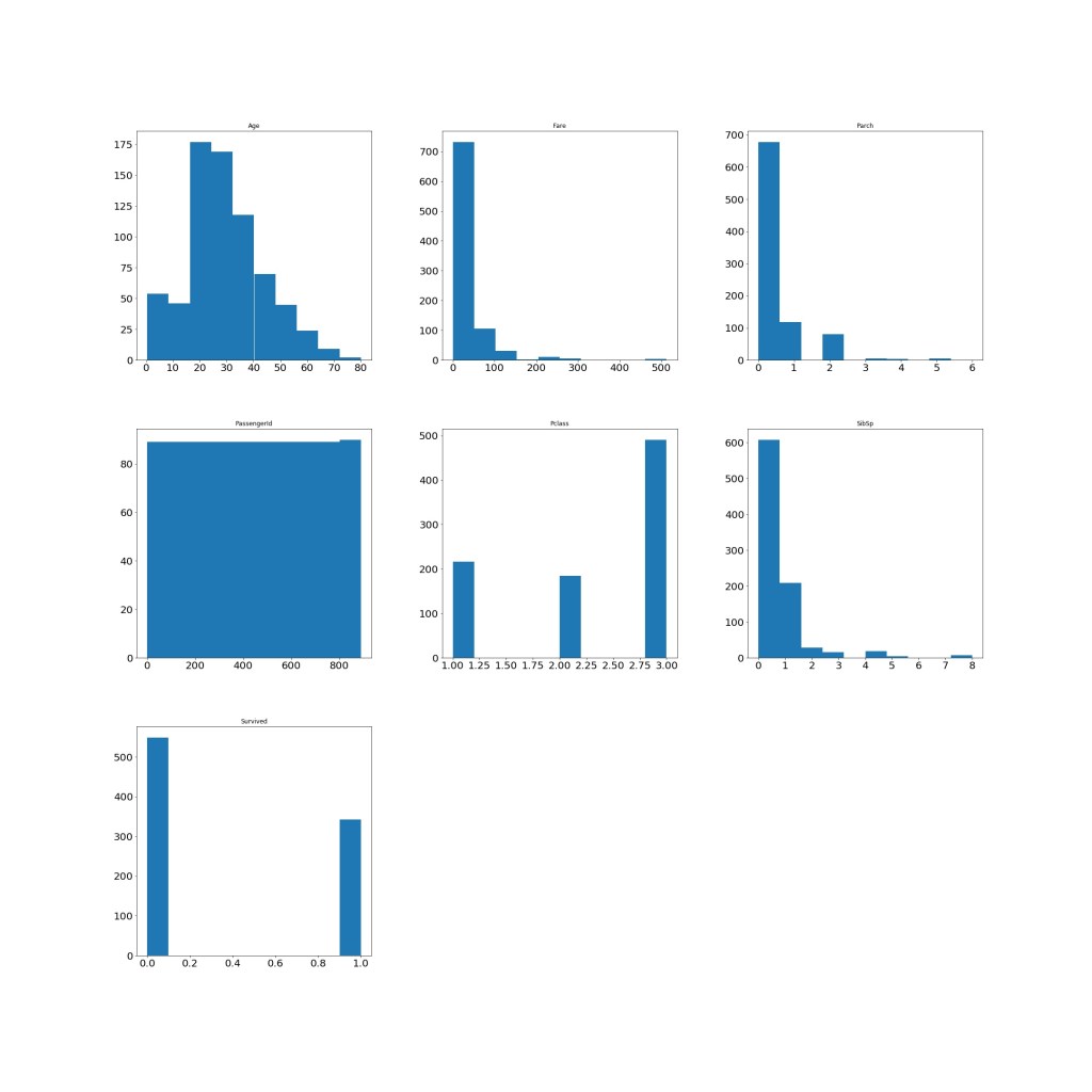
I won’t go through everything (and yes, it is very rough) but we can gain some basic insights from this. It might influence whether we want to create any new features or focus on certain features when trying to predict survival rates.
For example, we can see from the box plots that most people were roughly 30 years old and had one sibling on board (2nd row, first two box plots). From the histograms, we can see that most people were in passenger class 3 (we have no idea what that means in real life) and a lot of people on the titanic (at least in this dataset) were pretty young.
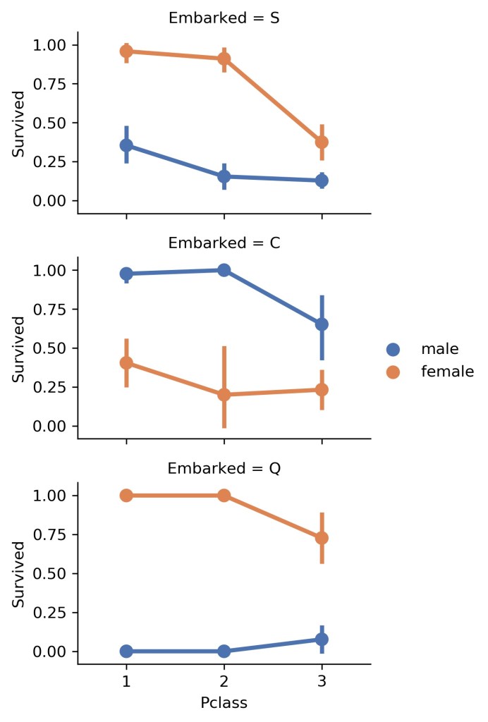
How does this impact survival? I’m glad you asked. Let’s look at some more graphs.


Now, we could just make predictions based off these factors if we really wanted to. However, we can also create features based on the information that we have. This is called feature engineering.
4. Creating a feature
I know, this seems like I’m playing God with data. In part, that is why I’m doing this. To feel something.
We have their names with their titles includes. We can extract their titles and create a feature called “Title”. With this, we’ll also be able to make a distinction between whether people with fancy titles were saved first or married women and so on.
for dataset in new_combined:
    dataset['Title'] = dataset.Name.str.extract(' ([A-Za-z]+)\.', expand=False)
You don’t need to understand everything or the variables here. They are specific to the code written which is found on my GitHub.
It basically takes the name “Braund, Mr. Owen Harris” and finds a pattern of the kind A-Za-z with a dot at the end. When this code is run, it’ll take out “Mr.” because it fits that pattern. If it was written as “mr” then the code would miss the title and ignore the name. It’s great, I’ll definitely be using the str.extract feature again.
5. Cleaning the data
A lot of data is bad. Data can regularly contain missing values, mistakes or simply be remarkably unhelpful for our goals. I’ve been told that this is large part of the workflow when trying to solve problems that require prediction.
We can get this information pretty quickly:
new_combined.info() #This tells us all the non-null values in the data set
new_combined.isna().sum() #This tells us which rows have null values (it's quicker then the first method)
In the titanic data set, we have loads of missing data in the “age” column and a small amount in the “embarked” column.
For the “age” section, I followed the advice from the tutorial linked above and guessed the ages based on their passenger class, and sex.
For the “embarked” section, because there were so few missing values, I filled them in using the most common location someone embarked on.
As you can see, cleaning data requires some assumptions to be made and can utilise different techniques. It is definitely something to keep in mind as datasets get bigger and messier. The dataset I’m working with is actually pretty good which is likely a luxury.
It isn’t sexy but important. I suppose that’s the case with many things in life.
5. Converting the data
In order for this information to be useful to an algorithm, we need to make sure that he information we have in our table is numerical.
We can do this by mapping groups of information to numbers. I did this for all features.
It basically follows this format:
for item in new_combined:
    item.Sex = item.Sex.map({"male":0, "female":1}).astype(int)
It is important to note that this only works if all of the info is filled in (which is why the previous step is so important).
For features that have a large number of entries (for example, “age” could potentially have 891 unique values), we can group them together so we have a smaller number of numerical values. This is the same for “fare” and the “title” feature created earlier.
It is basically the same as above but there is one prior step – creating the bands! It is simply using the “pd.cut()” feature. This segments whichever column we specify into the number of bands we want. Then we use those bands and say something like:
“If this passenger is between the age of 0 and 16, we’ll assign them a “1”.”
Our final table will look like this:
| Survived | Pclass | Sex | Age | SibSp | Parch | Fare | Embarked | Title |
|---|---|---|---|---|---|---|---|---|
| 0 | 3 | 0 | 1 | 1 | 0 | 0.0 | 1 | 3 |
| 1 | 1 | 1 | 2 | 1 | 0 | 3.0 | 3 | 4 |
| 1 | 3 | 1 | 1 | 0 | 0 | 1.0 | 1 | 2 |
| 1 | 1 | 1 | 2 | 1 | 0 | 3.0 | 1 | 4 |
| 0 | 3 | 0 | 2 | 0 | 0 | 1.0 | 1 | 3 |
6. Testing predictions with the test data
Now we have a table prepared for our predictions, we can select algorithms, fit them to our training data, then make a prediction.
While the previous stages were definitely frustrating to wrap my head around, this section certainly exposed just how much more there is to learn! Exciting but somewhat demoralising.
There are multiple models you can use to create predictions and there are also multiple ways to test whether what you have done is accurate.
So again, this is not a tutorial. Just an expose of my poor ability.
Funnily enough, I also think this is where it went wrong. My predictions don’t really make any sense.
To set the scene – we have:
- A table of features we’ll use to make a prediction (the above table) = X
- A prediction target (the “survived” column) = y
We can split our data into 4 sections and it looks like so:
train_X, val_X, train_y, val_y = train_test_split(X, y, random_state = 0)This splits our data into the four variables I’ve specified. “Random_state = 0” just means we get the same data split every time the script is run (so randomised data splits is false).
Now we can define our models. I picked a variety of different models to see what results I would get and will hopefully be able to explain the models in another post. However, a detailed understanding of them isn’t necessary at the moment.
I used two linear models and four non-linear models. The most accurate model I used was “SVC” or Support Vector Classification.
SVM = SVC(gamma='auto')
 #Defines the model

SVM.fit(train_X.drop(["Survived"],axis=1), train_y) #Allows the model to "learn" from the data we have provided

Y_prediction = SVM.predict(test_X.drop(["PassengerId"], axis=1)) #predicts the values that should be in the "survived" column

acc_log = round(SVM.score(train_X.drop(["Survived"],axis=1), train_y) * 100, 2)
 # Returns the mean accuracy based on the labels provided

acc_log # returns the accuracy as a percentage
My final result was 83.7% accuracy!
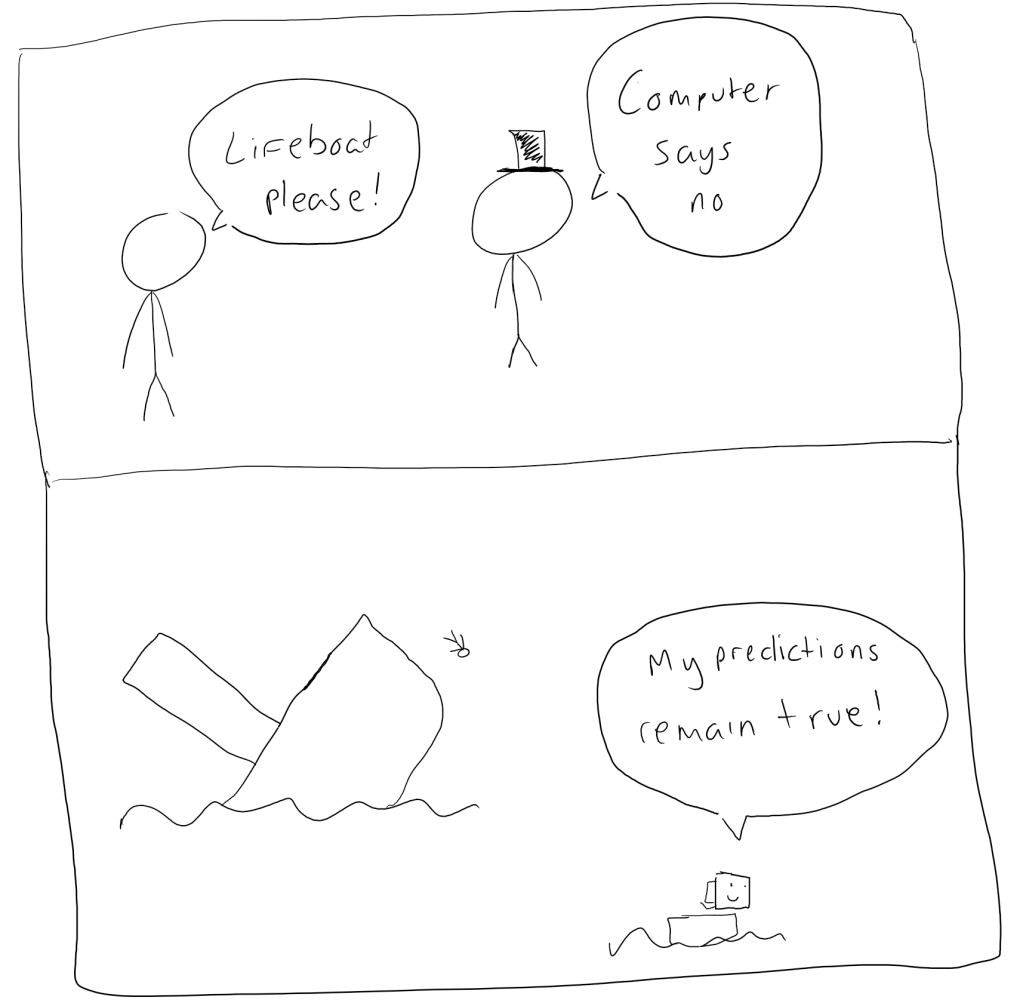
My first attempt led me to a 99.7% accuracy – Ain’t no way! And the kicker? It predicted everyone would die!

At this point, my brain rightfully died and I submitted my prediction to the Kaggle competition with it being better than 77% of other users. So there is much room for improvement.
8. Final thoughts
This is a beginner problem designed to help people get used to the basics of machine learning so the dataset is better than you’d usually get in the real world.
As I was working through this, I noticed that there are a lot of decisions we can make when creating a prediction. It sounds obvious but it’s important. This is where normal cognitive biases creep in which can go unnoticed – especially when the information we’re working with is far more complex and less complete.
For example, if any of the features were less complete, our decisions on how to fill them in would make a greater impact on our decisions. The algorithms we choose are never a one size fits all solution (which is why we often test many).
I’ll publish my code on my GitHub page when I’ve cleaned it up slightly and removed the swear words.
I’ve probably made a really dumb mistake somewhere so if you feel like looking at the code, please do let me know what that might be…
And with that, I bring it to an end.
There will be much more to improve and learn but I’m glad I’ve given this a shot.
Recent Data Science Somedays posts